
Jive Personas: Beyond Avatars
IgniteTech introduces the innovative AI "Clone" concept, enabling direct connection to organizational leaders through AI. Welcome to Enterprise Software reimagined.
Read the press release here.
THE THREE PILLARS OF OUR CORPORATE VISION
- Save and stabilize the software and businesses we acquire
- Innovate and transform all products to the AWS Cloud
- Add Unlimited Value with our Netflix-style licensing that includes all products in our solution suites
OUR CUSTOMERS PROVE OUR SUCCESS


SOME EXAMPLES
-
Pixar Animation Studios
Pixar Animation Studios uses AnswerHub as their knowledge-sharing platform of choice for their RenderMan team
Download -
Dun & Bradstreet
Dun & Bradstreet uses FirstRain to provide real-time, relevant web and social analytics to customers via D&B apps.
Download -
World Wide Technology
WWT sped up recruitment by 12-24 months, widened its talent pool and improved quality of remote work and training using Sococo.
Download
Latest News

Apr 17, 2024
IgniteTech Integrates AI Features Across Its Enterprise Software Portfolio
IgniteTech delivers AI-powered enhancements for 12 of its leading software products, available now…

Mar 28, 2024
IgniteTech Reinvents the Digital Workspace with AI-Powered Jive Personas, Unveiled at ImagineAI Live
IgniteTech CEO Eric Vaughan announces Jive Personas, empowering Jive customers with AI avatars that…
Sep 7, 2023
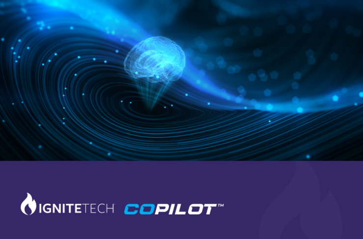
IgniteTech Announces GenAI Transformation Across its Entire Software Portfolio with CoPilot
IgniteTech, the enterprise software powerhouse known as "Where Software Goes to Thrive™," today…
Latest Blogs
Apr 17, 2024
IgniteTech Integrates AI Features Across Its Enterprise Software Portfolio
IgniteTech delivers AI-powered enhancements for 12 of its leading software products, available now…

Apr 11, 2024
Supercharge Your Team: Expert Knowledge on Demand with Jive Personas
Discover how Jive Personas, an innovative AI-driven solution, transforms the way organizations…

Apr 8, 2024
How computers understand Human Language
Unravel the mysteries of how computers understand human language through the fascinating world of…